In the Gallery with Darling Green
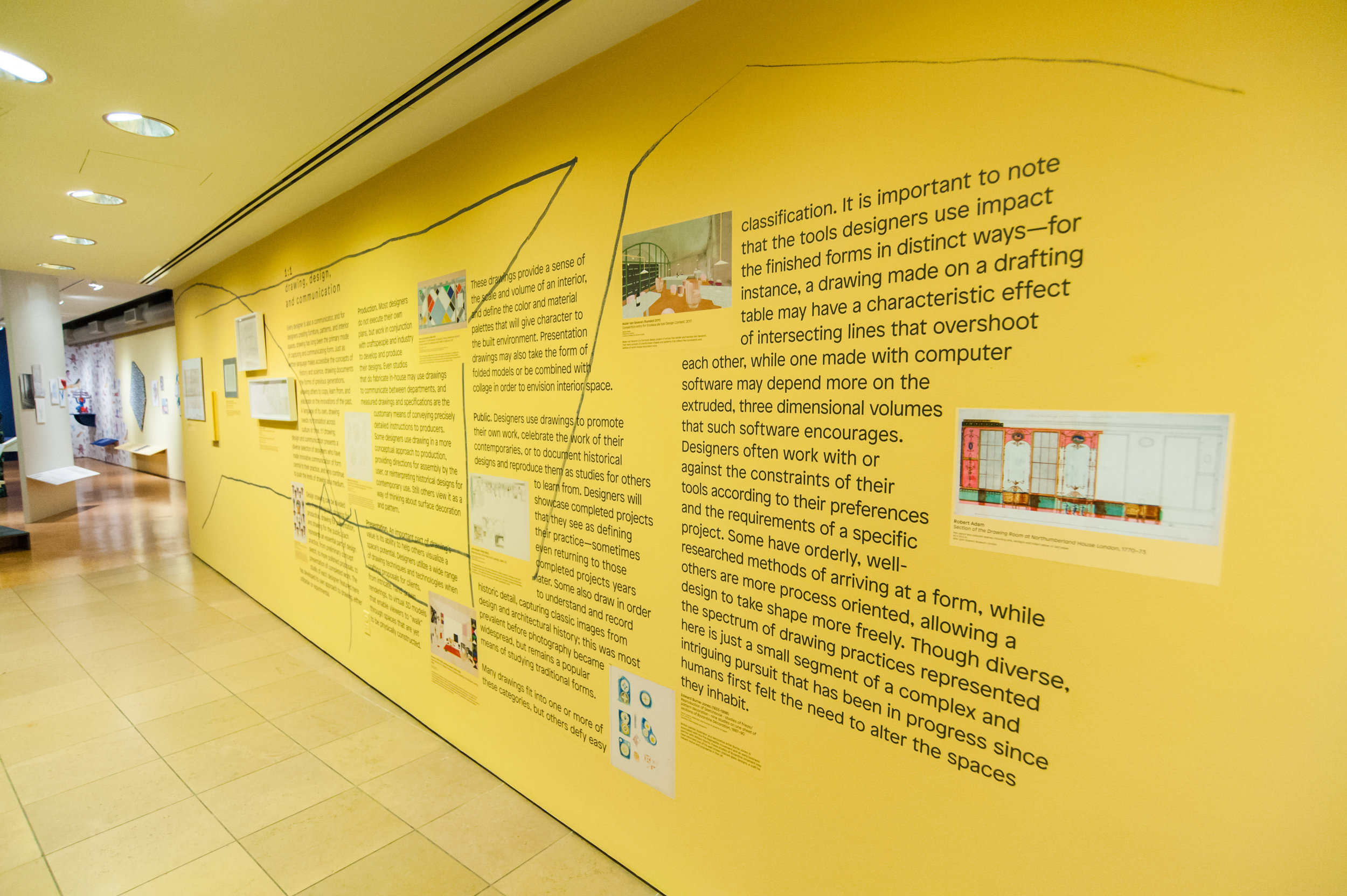
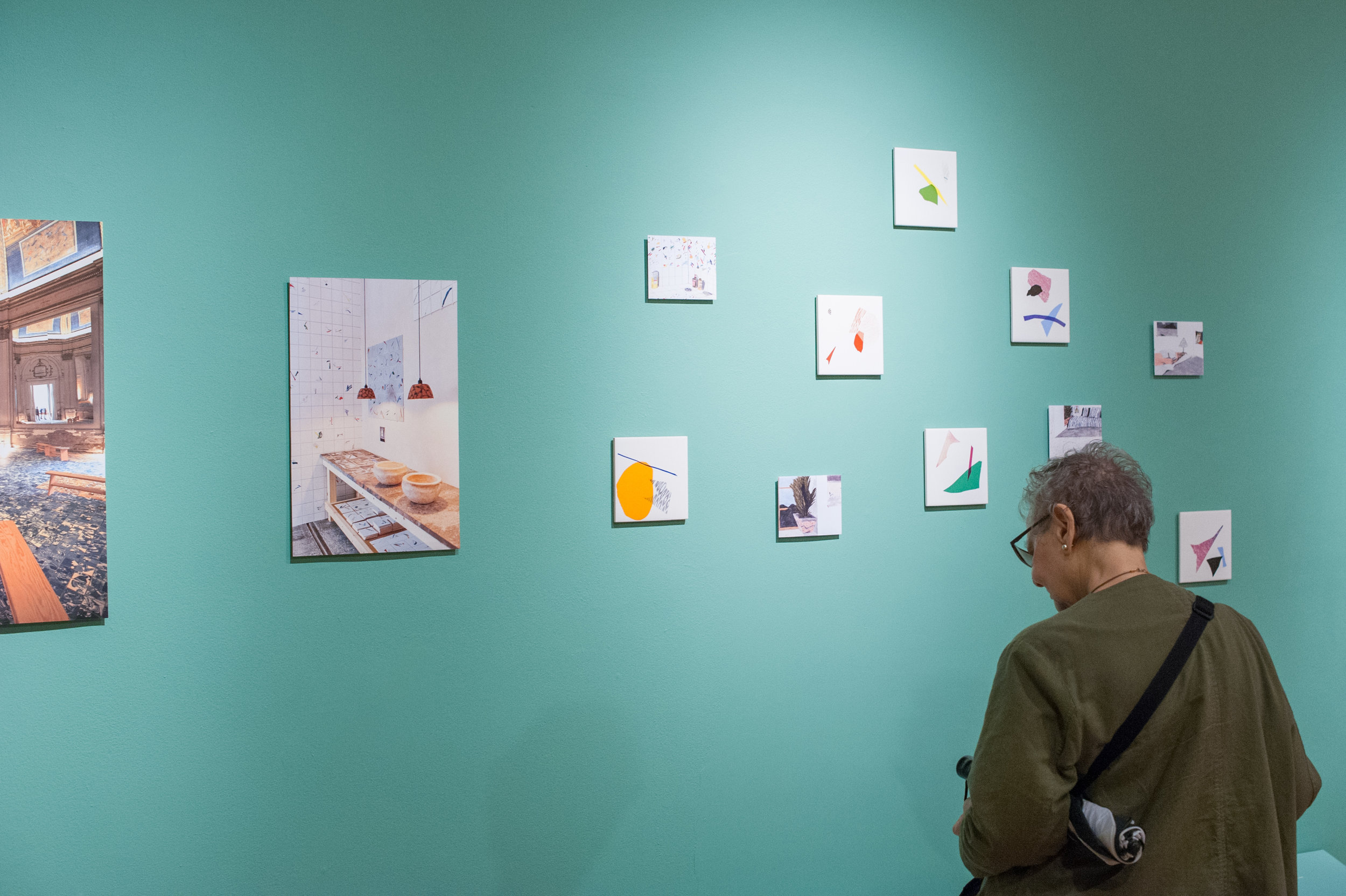
Our current exhibition, 1:1 drawing design and communication, which opened in the NYSID Gallery last month, examines different ways designers use drawing to communicate form. The title not only references scale notation, but also refers to the transmission of ideas between people. As one of the oldest human activities, drawing is fundamental to human thought process, and at the core of human understanding and communication.
I recently sat down with Jeremy Johnston, Ben DuVall, and Adrienne Rodewaldt of Darling Green, the collaborative studio that curated and designed the exhibition with assistance from curatorial consultant (and NYSID faculty member) Judith Gura, to chat about 1:1. The show packs lots of content into the gallery. Since I needed some direction on how to start the conversation, I asked the team a framing question, one appropriate for an exhibition mounted in a college gallery. If 1:1 were a NYSID course, what would be three learning outcomes? They exchanged glances, paused to consider the question, and then shared these key takeaways.
01 | Appreciate range of drawing practices
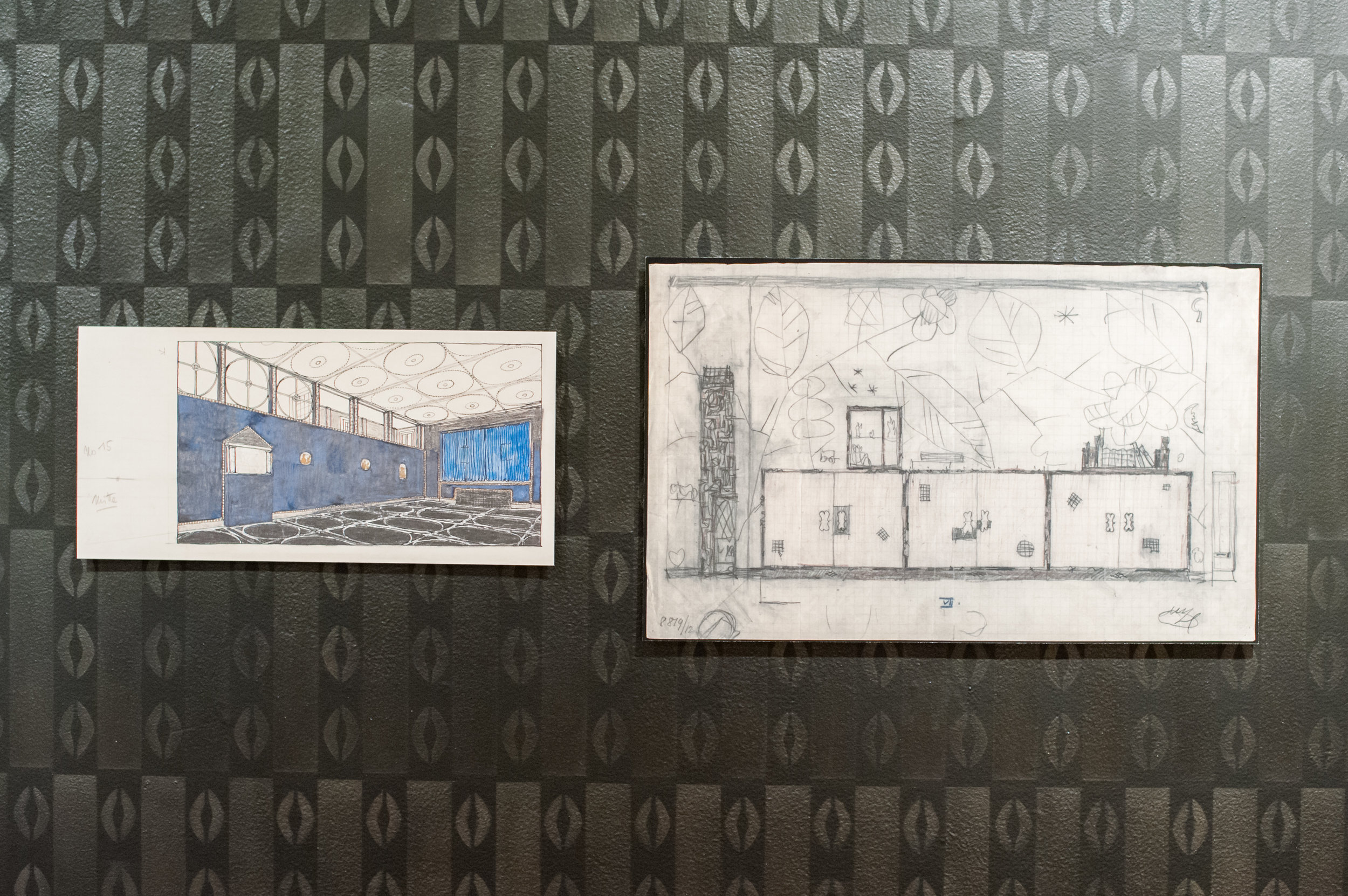
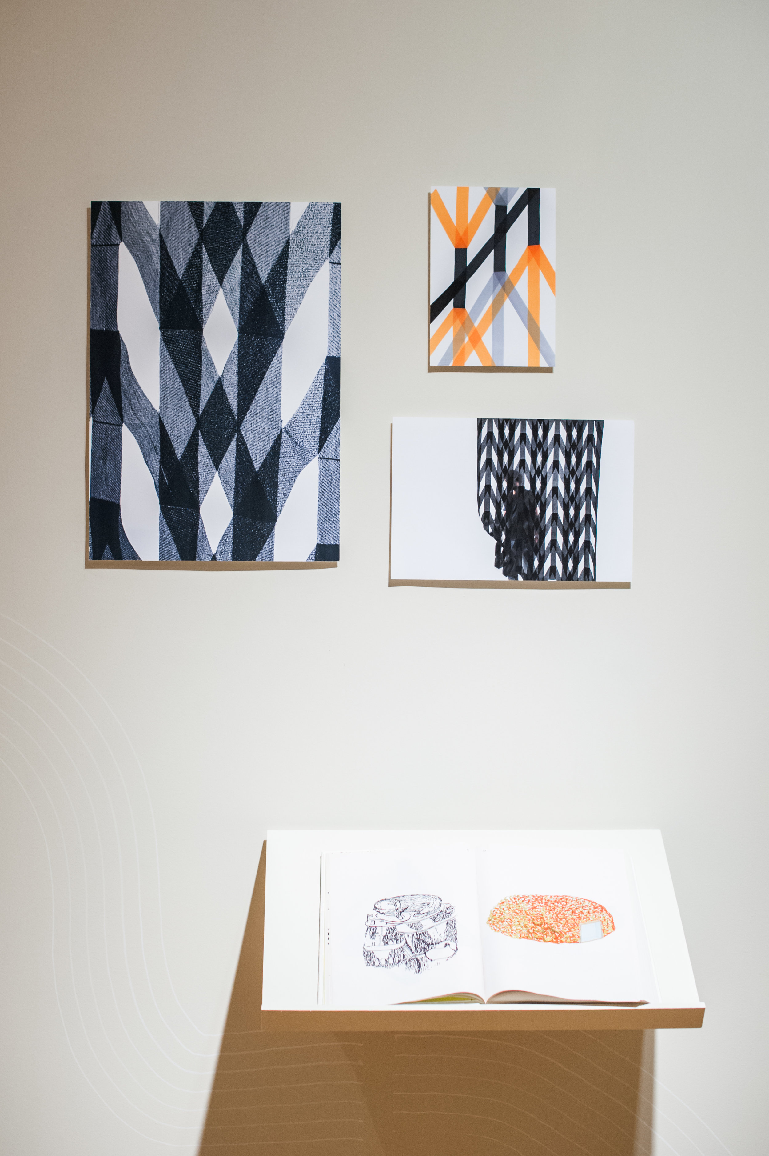
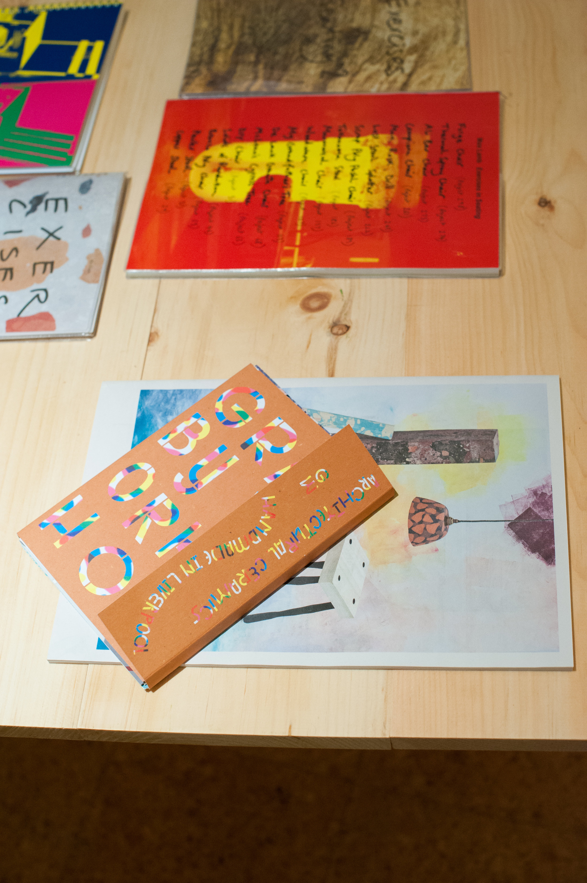
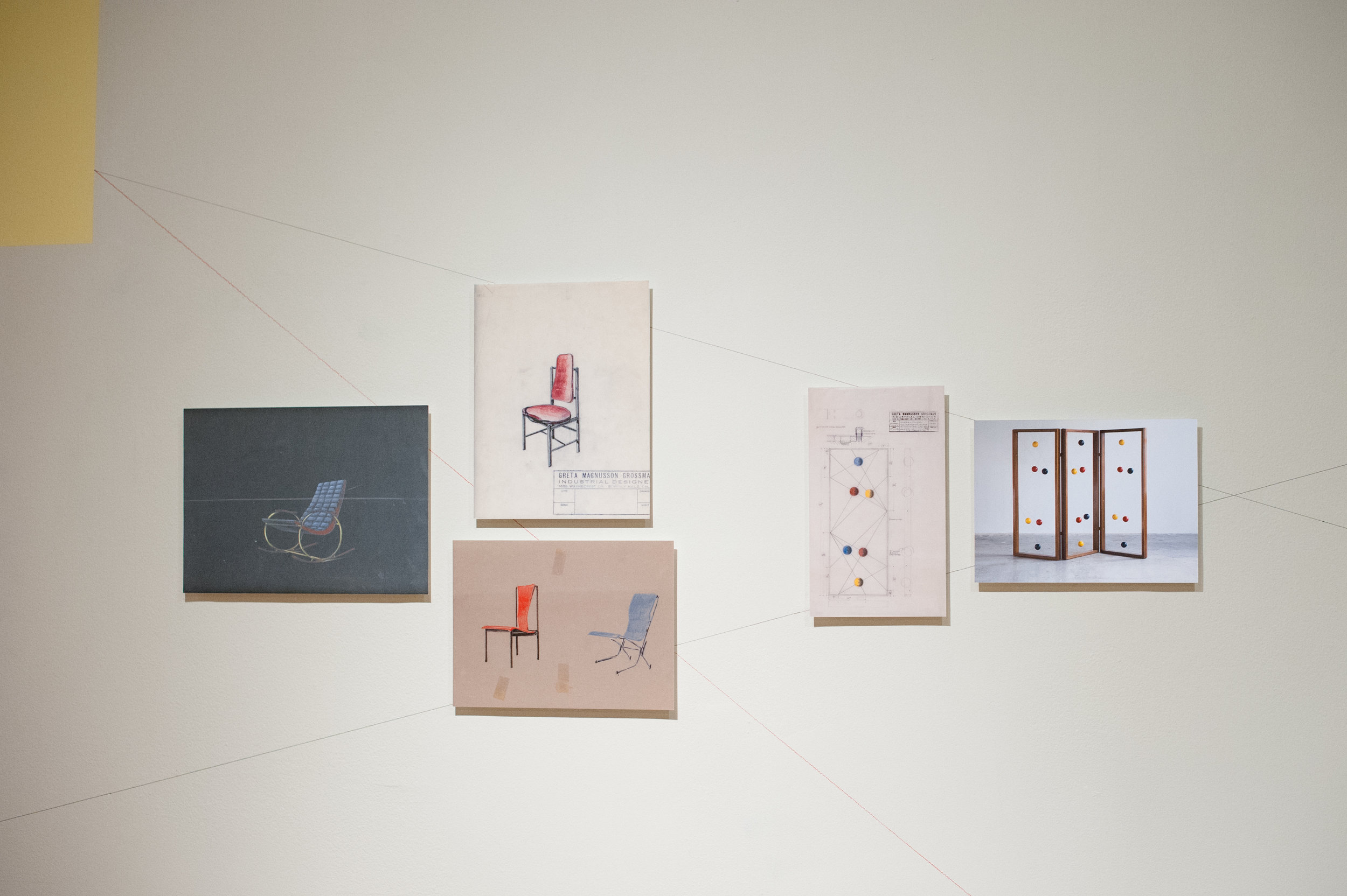
Drawing is an object, artifact, practice, and expression of design: It’s what designers do, and make. Jeremy wants us to appreciate the medium’s varied aims, and to understand the extent of its versatility. The best designers use this to their advantage. Ronan and Erwan Bouroullec, whose work is prominently featured, show us how drawing can be pushed in new directions. The French brothers view it as an expressionistic and abstract means of developing new forms. Many of these forms are translated into three dimensional objects. What I found most striking, and what relates directly to Jeremy’s idea, is their book, Ronan & Erwan Bouroullec: Drawing, a chunky volume of sketchbooks and drawings realized between 2004 and 2012, with more than 850 color and black-and-white works. It’s a diary of thought that uses form and color instead of the written word. Facing the Bouroullec section of the exhibition is the work of Greta Magnusson Grossman, a Swedish designer who worked in Southern California in the mid-20th century, designing furniture, lighting and interiors. On view are production drawings and a perspective rendering for the Frank Sinatra residence. Grossman designed 14 homes in Los Angeles, many for celebrities like Sinatra. Unlike the Bouroullec work, these drawings have a utilitarian purpose—to show manufacturers how to build a product, and to show clients how their home may look. Using very different means, both artists succeed in transmitting information, emotion, and ideas. They communicate.
In a separate conversation with design historian and curatorial consultant Judith Gura, she called my attention to the renderings in the final section of the exhibition, Drawing and Interior Design, to reinforce Jeremy’s point. “Interior designers today continue to make use of drawing —both analog and digital—in their practices, as a way to explore and refine their ideas, and in presentations to clients, who never fail to be impressed by skill with old-fashioned pen or pencil.”
02 | Study drawings to understand a designer’s process
Design isn’t magic. Looking closely at the drawings in the exhibition reminds you that it’s hard work. According to Adrienne, many process and product drawings are often hidden from view and as a result people fail to realize the challenges designers face. Exposure to these drawings can be particularly revelatory to students struggling to communicate their own vision, helping them overcome their fear of making those first marks either by hand or on the computer. They can pull back the curtain, glimpse other designers at work, and learn the backstory—the biography of an object, a room, an environment. In 1:1 a great example of this is the section on Gerritt Rietveld, the Dutch designer of some of the most iconic furniture of the of the early modernist period. These pieces are well documented, and the exhibition copy of his famous Red and Blue Chair (1917-23) was built by the Darling Green team using Rietveld’s drawings. Constructing the chair was a struggle, but in the end it gave them a window into the designer’s thought process and objectives.
03 | Acknowledge importance of speculative and aimless drawing
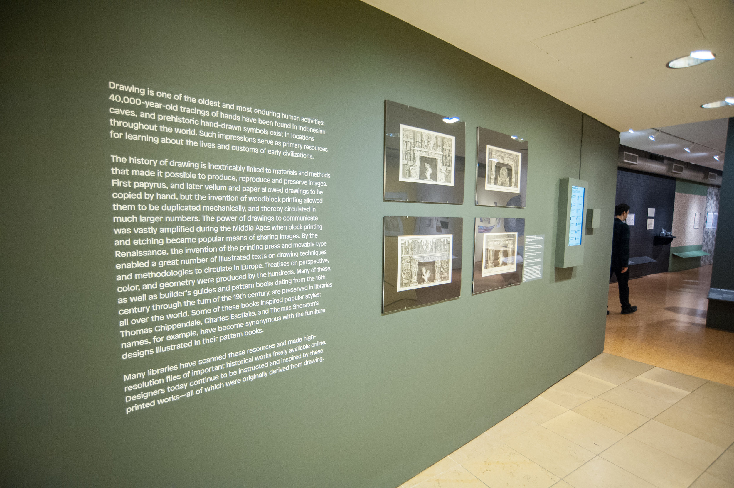
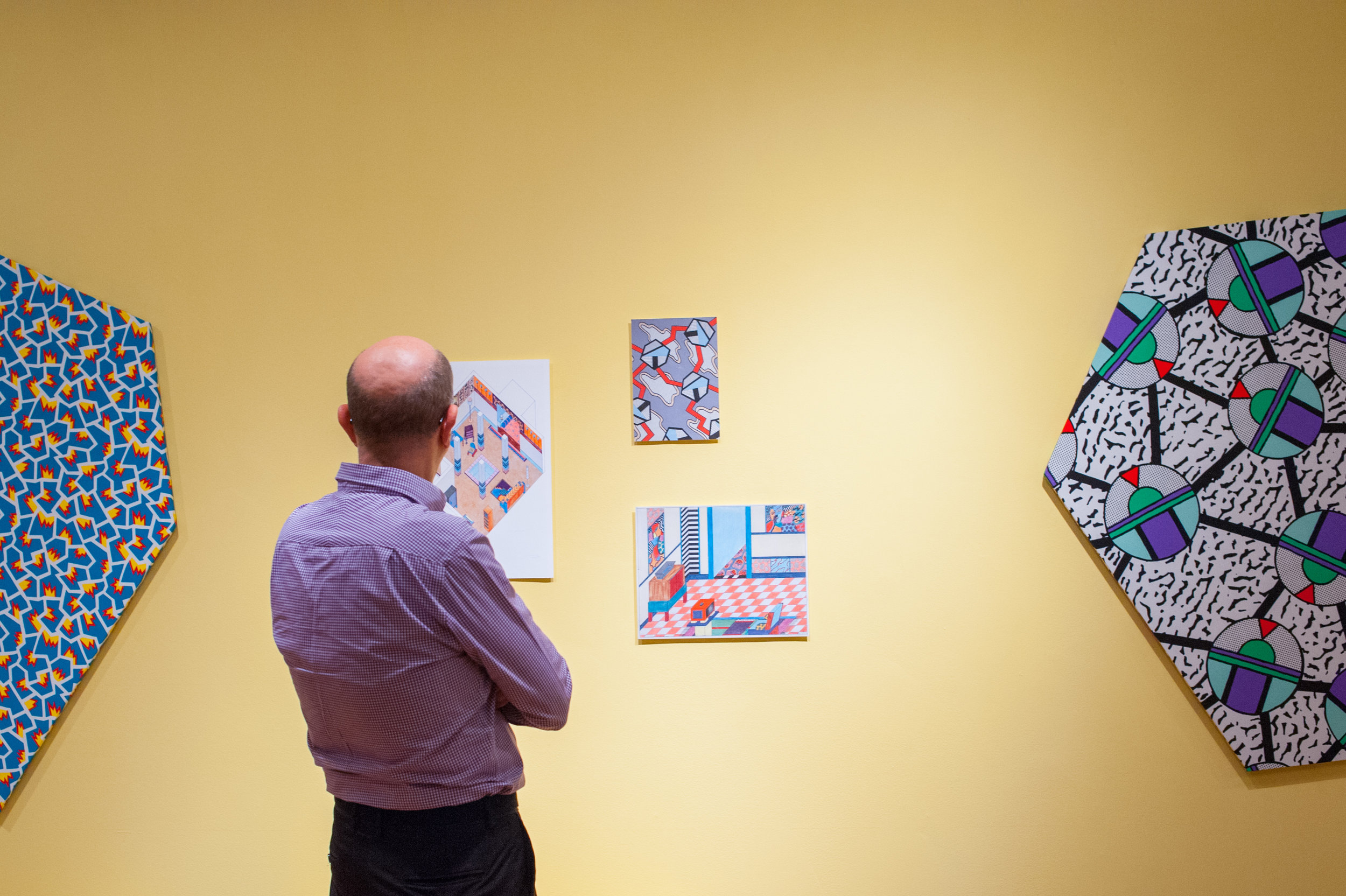
Drawing can be a dynamic way to explore and discover new ideas. In retrospect, Ben realized he could have added another category, Drawing for Pondering, to the three more utilitarian uses mentioned in the introductory text: Drawing for Production, Drawing for Presentation, and Drawing for the Public. Designers have long used drawing to create and explore imaginary worlds of the mind. Many have focused their attention on circuitous and meandering process rather than product. Giovanni Battista Piranesi, the 18th century Italian artist famous for his etchings of Rome, is represented by original prints of designs for fantastical fireplaces that combine motifs from around the world. Compare these to the work of Nathalie Du Pasquier, a designer who was part of the Memphis group, the Milan-based collective that made postmodern design an international phenomenon in the 1980s. Her brightly colored patterns, which her textiles are famous for, is evident in her speculative drawings of architecture and interiors, imaginary environments that exist solely as an exercise of process and form.
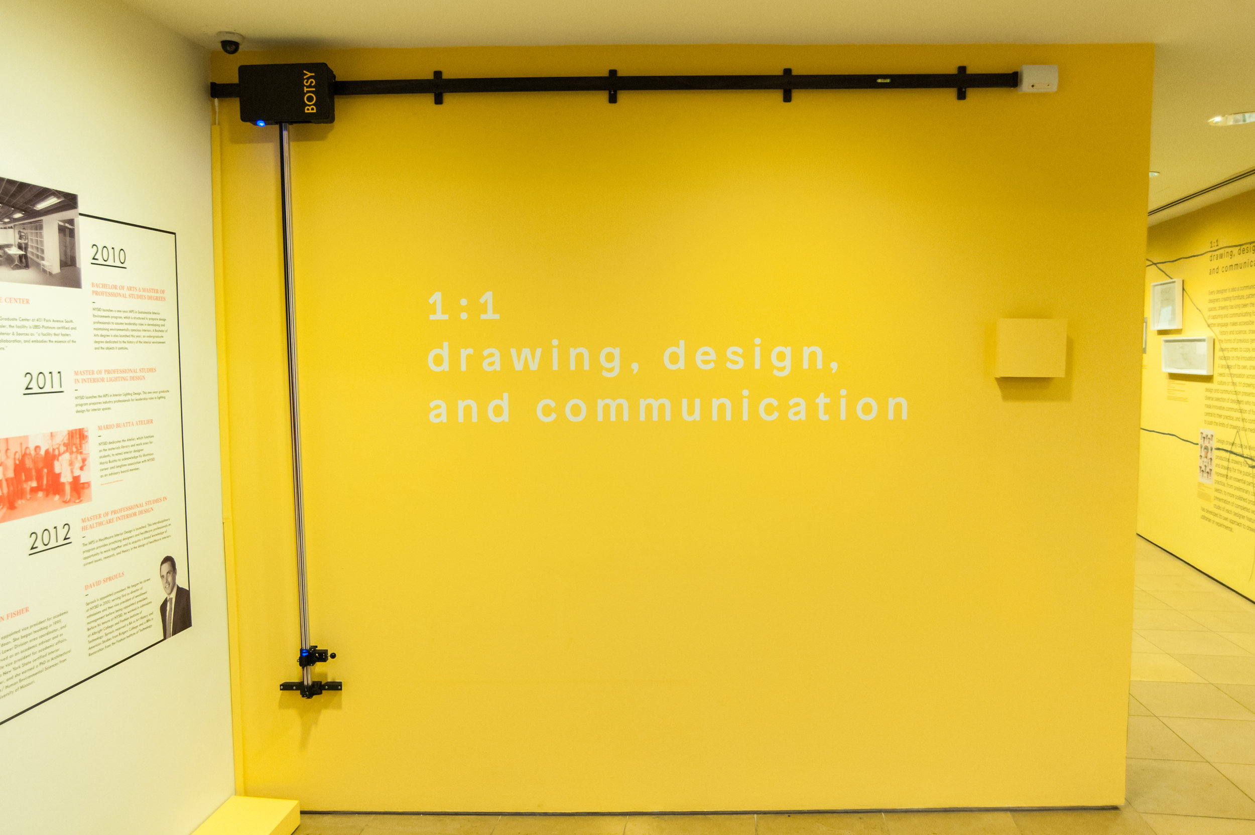
For Darling Green, the most rewarding part of creating 1:1 was the collaboration between their team, the College, and the designers and galleries who loaned the work. Working on what became an immersive community drawing, Jeremy, Ben, and Adrienne discovered that the exhibition process itself became a way to think about drawing practice: how we use it now and how we’ll use it in the future. On a practical level, it also required them to wear many hats. In addition to sourcing/coordinating loans, licensing images, writing texts, and designing the exhibition, Darling Green developed two interactive touch screen kiosks, provided a drawing machine that composes the title wall (the BOTSY), built furniture, and executed several hand-drawn decorative elements. In spite of this thorough planning and complete control, the team was careful not to provide a clear path to follow; instead they want visitors to make their own discoveries and connections—they want them to reach their own conclusions. Thinking of the exhibit in this way reminds me of the often used but still powerful quote by the artist Paul Klee, “A drawing is simply a line going for a walk”. Go for a walk through this exhibition. You have until November 10.
Chris Spinelli
(Chris Spinelli is the Art Director at NYSID and a part-time faculty member)
