A Color Story
Strong Color Sense Comes from Experience
The way NYSID teaches color for interiors is both traditional and innovative. Fine artist and NYSID instructor William Engel ’02 (AAS), and retired NYSID professor Ethel Rompilla ’84 (BFA), formative influences on how color is taught at NYSID, discuss what goes into having an educated “eye” for color. Alumna Andrea LaConte-Magno ’02 (AAS), director of color marketing and development at Benjamin Moore, sheds light on her exciting career in color.
Many people believe they are born with a great sense of color. The faculty at NYSID who teach Color 141 (Color for Interiors) and Color 339 (Advanced Color) believe that selecting colors for interiors is also about experience.
First, Understand the Complexity of Color
At NYSID, Color 141 is offered as an on-site course, as well as an online course that can be taken synchronously in real-time (DR) or asynchronously (DL). Several different faculty members teach Color 141. The DL courses draw on videos of retired NYSID instructor Ethel Rompilla an octogenarian who literally wrote the book on color, a seminal work called Color for Interiors. She stars in these videos with NYSID alumni and instructor Stefan Steil ’08 (BFA) / ’10 (MFA2), principal of Steilish Interiors & Architecture and a designer known for the evocative color stories in his interiors.
For years, NYSID has been able to offer more choice and increased access through distance learning. The Basic Interior Design Certificate (BID), Associate in Applied Science in Interior Design (AAS), and Masters of Professional Studies in Sustainable Interior Environments (MPSS) have been offered remotely for years. The Masters of Professional Studies in Lighting Design (MPSL) is now offered fully online. The College has received permission from the New York State Education Department and the Office of the Professions to develop an online Bachelor of Fine Arts in Interior Design. This program will open for applications soon.
“Most people don’t realize that color has many dimensions,” says Rompilla. “It’s incredibly complex, and this is the way we have always taught it at NYSID. You must understand whether a color is light, dark, neutral, or saturated, and its undertones of other colors. The only way to understand color is to mix hundreds of paints, so you can understand, for example, how to neutralize it if it’s too saturated, or what happens if you add blue.”
Students in every NYSID Color 141 course mix gouache paints by hand, but first they are introduced to the history of color and color theory, most importantly the Munsell Color system, which Albert Munsell created in the early 20th century and based on three properties: hue (basic color), chroma (color intensity), and value (degree of lightness or darkness). Beyond that, says Rompilla, “You have to understand the effect of light on color, the psychology of color, what colors mean to different cultures, and the interaction of colors in close proximity to one another. You can take a color, surround it with a different color, and it will look very different. This is what the Impressionists did, especially (Georges-Pierre) Seurat. The eye mixes colors that are near each other (a phenomenon known as optical blending).”
Though retired, Rompilla, an iconic color expert, NYSID alumna, and beloved member of the NYSID community, is able to pass on her expertise to a new generation of NYSID students through the medium of online learning.
ABOVE: WILLIAM ENGEL IN FRONT OF ONE OF HIS PAINTINGS.
RIGHT: ANDREA LACONTE-MAGNO, DIRECTOR OF COLOR MARKETING, AND DEVELOPMENT AT BENJAMIN MOORE.
Next, Use Color as the Driver of Design
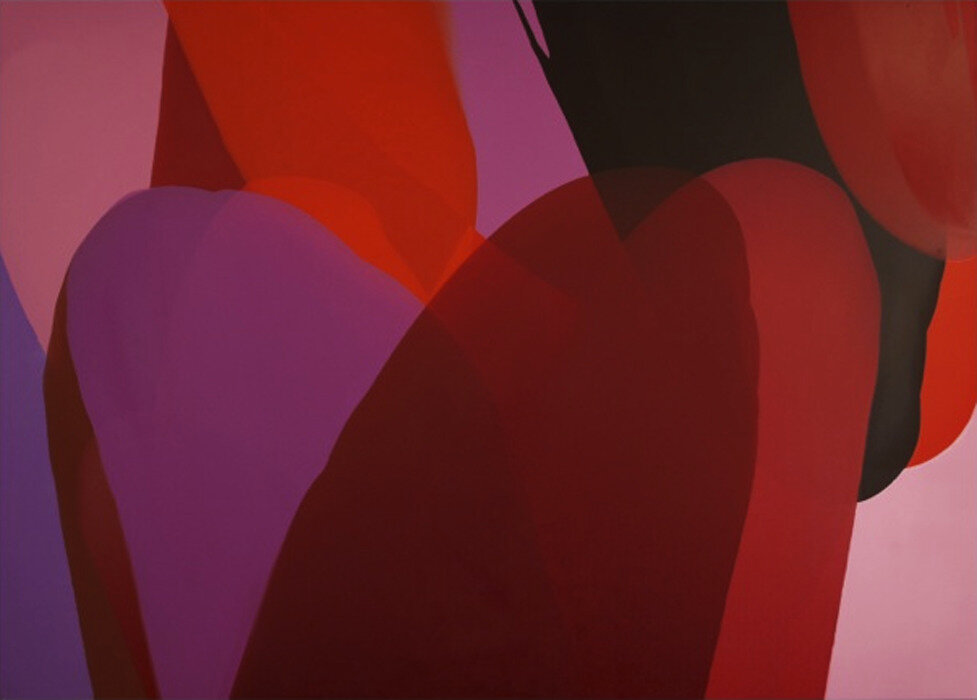
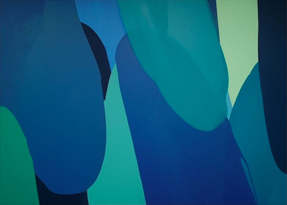
Alumnus William Engel is a painter who works closely with interior designers and architects to create artwork that helps tell the story of a space, or a whole building, through color. He maintains painting studios in the Chelsea neighborhood of NYC and in San Diego, California. He’s also a legendary NYSID instructor who has been teaching color for 16 years at the school (and other courses for longer). After years of teaching Color 141, he worked with NYSID’s Office of Academic Affairs to develop NYSID’s Advanced Color course (for graduates and undergraduates), also known as Color 339.
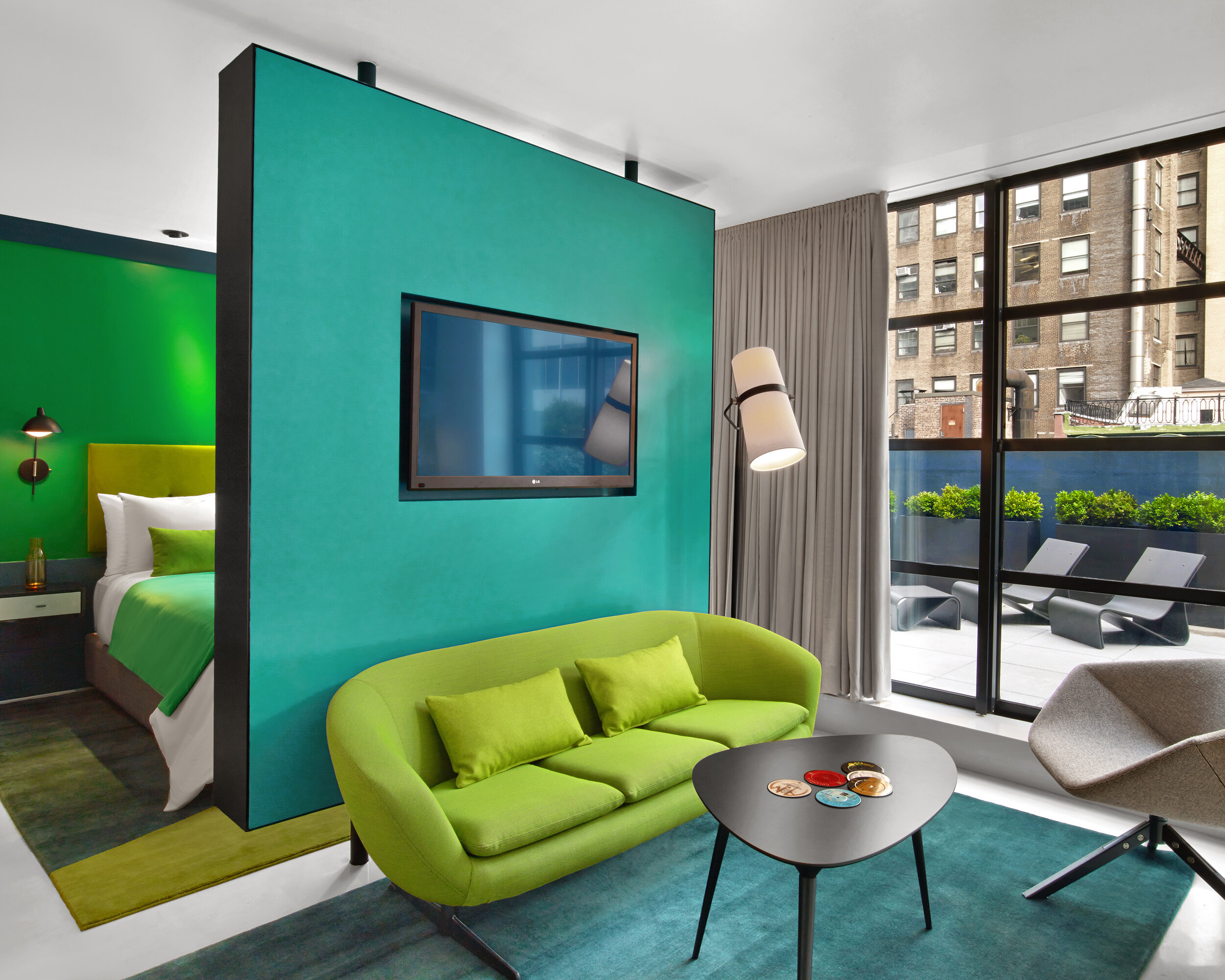
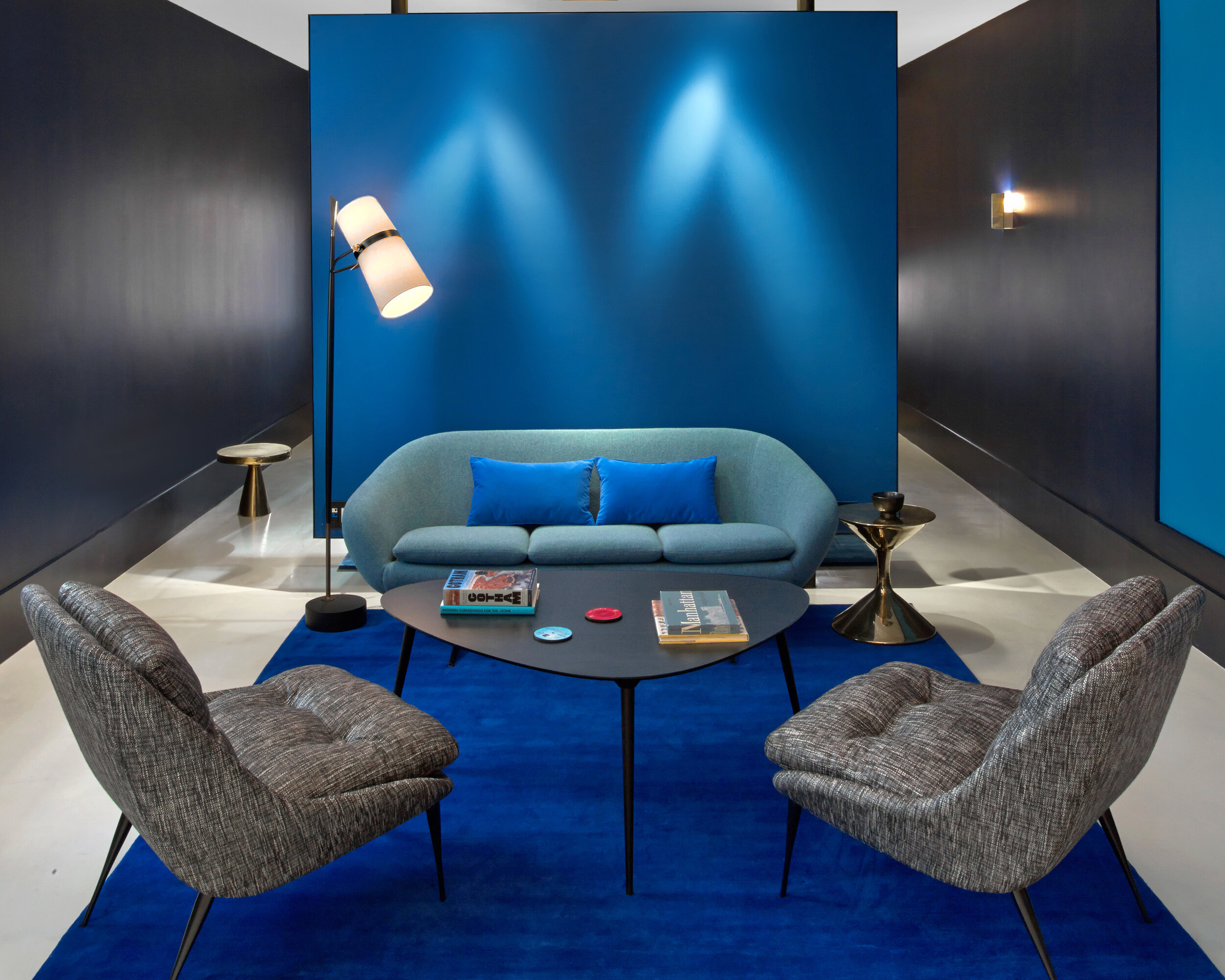
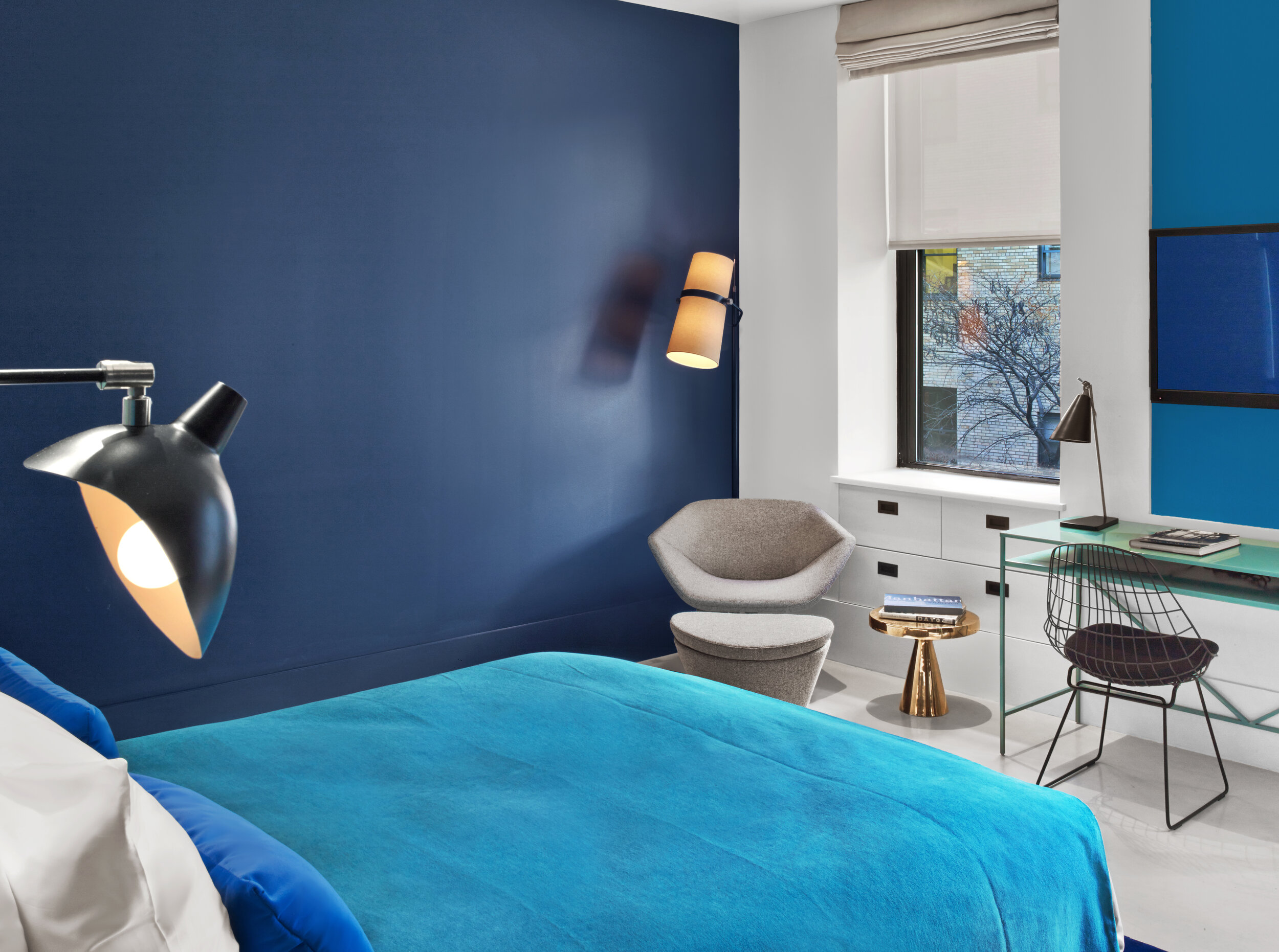
Engel says, “The difference in the Advanced Color course is that we are working with color as a driver of the design project rather than an application.” Engel got the idea for the course when he was collaborating with Edwin Zawadzki, the cofounder of In Situ Design, and Lilian Bakhash, the owner of Lilian B Interiors (both NYSID faculty members) on the William Hotel in Manhattan. Engel and Zawadzki pitched the hotel developer the concept of a hotel that evoked the impression of “poured color, with every floor representing a different hue.” The design treated the entire interior of this twin Victorian townhouse as a canvas for color.
The assignments in Advanced Color challenge students to derive a design concept from color. For example, Engel challenges students to analyze a movie in regards to how the director uses color to advance the form and narrative of the film. He then challenges the students to apply the color story of a specific film to a space with an entrance hallway, boxy space, transitional hallway, and open living space, so that students begin to understand how color moves people through space and emotion. Engel allows the students to select any film, from North by Northwest to Cinderella. Says Engel, “They have to use the film’s color story to create movement and moments within this space. What comes out of this assignment is fascinating. They get so into it.”
For the culmination of Advanced Color, students have to analyze one painting, or the body of work, from an artist they admire. They then have to break down the color scheme of the painting into a palette and apply it to a SketchUp or PowerPoint presentation of a small apartment for a client. The students have to be able to communicate about their color choices and how they relate to the artwork, a skill that is an invaluable component of the design process.
The Advanced Color course is conceptual, but also very hands-on. For one assignment, Engel asks students to put on their aprons and paint triptychs. He also believes that in today’s increasingly digital world, students have to be able to communicate the specifics of a color digitally. Early in the course he asks students to take a color they love from Benjamin Moore, print it on the computer, match it in Photoshop, and tweak the color until they can be sure the color they show their client in a presentation matches what will go in the space. “Understanding the difference between what we see on the computer and the actual color in three-dimensional space is crucial, he says. “This has to be part of color education now.”
Consider a Career in Color
Andrea LaConte-Magno, director of color marketing and development at Benjamin Moore, will never forget her first color class at NYSID. She says, “I had a background in studio art and had been an art history major at Lafayette College, so I already knew a lot about color, but at NYSID we were taught to consider how color lives in three-dimensional spaces, and to mix artists’ paints in precise amounts to complement colors found in fabrics and other materials. This knowledge still comes into play with almost everything I do at Benjamin Moore.” Back then, a guest lecturer in her course on materials and finishes, the well-known color marketer Ken Charbonneau, then director of color at Benjamin Moore, left her inspired. She remembers, “I was hanging on every word.” Little did she know that decades down the line she would become one of his successors, occupying the equivalent position at Benjamin Moore. Says LaConte-Magno, “One of the things that was great about NYSID were the industry connections that faculty brought into class.”
LaConte-Magno encourages NYSID graduates to “go into their careers with open minds” about where they might wind up in the design industry. She got an internship at the prestigious residential interior design and architecture firm Ingrao, Inc. when she was still in the Associate program, and was hired full time after graduation. She loved designing interiors, but when presented with a position focused on designing color schemes for commercial properties for Benjamin Moore, she went for it because she has always understood the power of color.
“I have always been drawn to color because there is something so transformative about it. You can create such a different mood just by changing the color on the walls,” she says. “Working with people to find the right color, listening to what they are looking for, seeing it come to fruition, and experiencing the happiness it brings to clients is really gratifying.”
LaConte-Magno was promoted four times at Benjamin Moore, taking on the role of director of color marketing and development in 2019. Among the aspects of her job she loves most is the research and travel that goes into forecasting color trends. She says, “I think of color research much like the work of an anthropologist, digging for influences and then bringing it together to develop our color trends palette each year.” She adds, “I also have a strong focus on understanding the needs of the customer when it comes to color, whether that customer is a homeowner, a contractor, or a professional designer. We develop tools, both physical and digital, to help people make solid and informed decisions about color.”
LaConte-Magno notes, “Everybody wants to work for a big architecture firm while they are in school but there are opportunities out there that are different and really fulfilling. I had no idea this kind of role event existed. There may be a niche that works for your individual talents that becomes the perfect route for you.”


